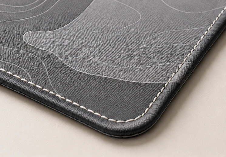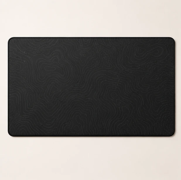
Contour lines occupy an unusual middle ground. They carry a great deal of real detail — every line is genuine information about a real landscape — and none of that detail competes for meaning at a glance. On a surface you look at all day but never look at, that combination is close to ideal.
It is not an accident that topographic prints have outlasted most desk mat trends. The reasons are structural.
Pattern without a subject
A photograph has a subject, and your eye keeps returning to it. That is what a photograph is for, and it is a liability on furniture: a face, a horizon or a bright focal point sitting in the lower half of your vision will be found again every time you look up.
A contour map has structure without a focal point. The lines run dense here and sparse there, they curve and nest and run parallel, but there is no place the composition tells you to look. At working distance it reads as texture. Lean in and it resolves into detail. Neither state asks anything of you.
It survives being covered
Here is something people rarely account for when choosing a print: at least half of any desk mat spends its life underneath a keyboard, a monitor foot and two forearms. Whatever you liked about the full image, what you actually live with is the leftovers.
Distributed patterns take that well. Hide two thirds of a contour map and the visible third is still a contour map — same character, same density, nothing conspicuously missing. Hide two thirds of a composed image and what remains is a fragment, usually an awkward one, because compositions are built around a centre and the centre is exactly where the keyboard goes.
This is the strongest argument for pattern over picture on a desk, and it applies just as well to abstract textures and monochrome fields.
It reads at two distances
Good desk surfaces work at 70 cm and at 20 cm. Most prints only manage one.
At 70 cm — normal seated distance, seen peripherally — contour lines blur into a soft directional grain. It looks like a material rather than an image, which is what you want from something in the corner of your eye for eight hours.
At 20 cm — reaching for something, or simply noticing your desk for a moment — the lines separate and become legible again. Ridges, valleys, a coastline. The reward is there when you go looking for it and absent when you are not, and very few prints manage both.
Line weight is the whole design
Not all topographic prints behave the same way, and the variable that decides it is line weight relative to spacing.
- Fine lines, wide spacing — reads as almost plain at working distance. The most forgiving option, and the right one for a large mat, where a heavy pattern gets repeated across a great deal of surface.
- Heavy lines, tight spacing — reads as a strong texture, close to a solid mid-tone. Handsome, but a more assertive object in the room, and it works better at Large than at Full Desk.
If you are choosing between two contour prints and cannot decide, the finer one is the one you will still like in a year.
Where topography stops working
It is not universal, and it fails in two specific ways.
High contrast ruins it. Black lines on white put maximum tonal difference directly beneath a white mouse cursor, and the cursor becomes measurably harder to track — a real cost if you play anything competitive. Contour prints want a narrow tonal range, which is why the ones that work tend to be tone on tone.
And it stops working if the map means something specific to you. A contour of a place you love is a lovely idea and a poor desk mat, because it has a subject after all — and your eye will find it, every day, right in the middle of your work.